How to Choose the Perfect Color Palette for Your Home
Introduction
Choosing the right color palette is one of the most important decisions in home design. Colors influence how a room feels, how large it appears, and even how comfortable it is to spend time in. Whether you’re moving into a new home or refreshing your current space, selecting colors that complement your style can completely transform your interiors.
From calming neutrals to bold accent shades, the right combination of colors creates harmony throughout your home. This guide will help you understand color psychology, learn the difference between warm and cool tones, choose suitable colors for every room, and explore the latest home color trends.
Why Color Matters
Color is much more than decoration—it affects mood, comfort, and the overall atmosphere of your home.
For example:
- Light colors make rooms appear larger and brighter.
- Dark colors create warmth and sophistication.
- Soft neutral shades provide a timeless look.
- Bold colors add personality and create focal points.
Before selecting paint colors, consider how you want each room to feel. A relaxing bedroom may benefit from calming shades, while a dining room can feel more welcoming with warmer tones.
Understanding Warm vs. Cool Colors
One of the easiest ways to build a cohesive color palette is by understanding the difference between warm and cool colors.
Warm Colors
Warm colors include:
- Beige
- Cream
- Terracotta
- Mustard
- Warm browns
- Soft peach
These colors create a welcoming, cozy atmosphere and work well in living rooms, dining areas, and kitchens.
Cool Colors
Cool colors include:
- Blue
- Green
- Grey
- Lavender
- Soft teal
Cool tones promote relaxation and are ideal for bedrooms, bathrooms, and home offices.
Neutral Colors
Neutral shades such as white, ivory, greige, taupe, and soft grey remain popular because they pair easily with almost any accent color and suit a variety of design styles.
Choosing Colors for Different Rooms

Every room serves a different purpose, so your color choices should reflect how the space is used.
Living Room
The living room should feel comfortable and inviting.
Popular colors:
- Warm white
- Light grey
- Beige
- Sage green
- Earthy brown
These colors create a welcoming environment while allowing furniture and décor to stand out.
Bedroom
Bedrooms should encourage rest and relaxation.
Recommended shades:
- Soft blue
- Sage green
- Lavender
- Warm beige
- Dusty pink
Avoid overly bright colors if you’re aiming for a peaceful atmosphere.
Kitchen
Modern kitchens often feature clean, fresh colors.
Popular choices:
- White
- Cream
- Olive green
- Navy blue
- Charcoal accents
These colors work well with wood finishes, marble countertops, and stainless-steel appliances.
Bathroom
Bathrooms benefit from fresh, calming shades.
Good options include:
- White
- Aqua
- Pale blue
- Soft green
- Light grey
These colors help create a spa-like feel.
Home Office
Choose colors that support concentration and productivity.
Recommended shades:
- Soft green
- Light grey
- Blue
- Beige
These tones reduce visual distractions while maintaining a professional appearance.
Tips for Small Spaces
Color can make even the smallest room feel larger.
Use Light Colors
White, cream, and pale grey reflect more light, making rooms feel spacious.
Create Flow
Using a consistent color palette throughout connected rooms creates visual continuity and makes your home appear larger.
Add Mirrors
Mirrors reflect both light and color, helping expand the appearance of small spaces.
Limit Bold Colors
Instead of painting an entire room in a dark shade, use bold colors through cushions, artwork, rugs, or decorative accessories.
Paint the Ceiling Light
A light-colored ceiling gives the illusion of extra height and openness.
Trending Color Palettes
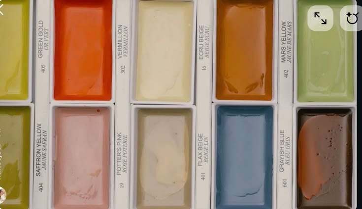
Interior design trends continue to evolve, but several color palettes remain popular because they combine style with versatility.
Earthy Neutrals
- Sand
- Beige
- Clay
- Terracotta
- Warm brown
Perfect for modern and Scandinavian-inspired interiors.
Nature-Inspired Greens
Shades like olive, sage, and eucalyptus bring a sense of calm and work beautifully with natural wood and indoor plants.
Soft Minimalism
White, ivory, greige, and light taupe create clean, elegant spaces with a timeless appeal.
Deep Accent Colors
Rich shades such as navy blue, forest green, and charcoal are often used on feature walls or cabinetry to add depth and sophistication.
Warm Contemporary Palette
Combining cream, caramel, oak wood tones, and matte black accents creates a balanced, modern interior that feels both stylish and welcoming.
Common Color Mistakes to Avoid
Before finalizing your palette, avoid these common mistakes:
- Choosing paint without testing samples first.
- Using too many bold colors in one room.
- Ignoring natural and artificial lighting.
- Forgetting to coordinate wall colors with flooring and furniture.
- Following trends without considering your personal style.
Testing paint samples on different walls and observing them throughout the day can help you make a more confident decision.
Conclusion
Selecting the perfect color palette doesn’t have to be overwhelming. By understanding how colors influence mood, choosing shades that suit each room, and creating consistency throughout your home, you can design interiors that are both beautiful and functional.
Whether you prefer timeless neutrals, calming greens, or bold statement accents, the best color palette is one that reflects your personality while enhancing the way you live. Start with a few carefully selected colors, test them in your space, and build a home that feels comfortable, inviting, and uniquely yours.